Since the past few years there has been a massive growth and in new trends of in the world of web design. The development and implementation of web navigation and patterns the developers have been adopting also has increased drastically. The navigation trends work well with all variety of websites along with different responsive web design.
The navigation techniques also are able to adapt through different screen shapes and sizes which gives you a lot of variety in your innovation.
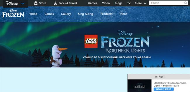
Sticky Navbars
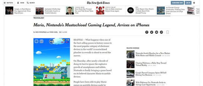
A nav menu in a fixed place enables users to navigate the website from anywhere on the page. Most of the websites seem to stick their navigation on the top if the page as the user scrolls down to explore content.
A fixed nav bar also benefits the mobile users, where the sites are naturally longer and thinner.
How should you use it?
It is better to have a fixed menu if you have lots of navigation items in it. It can surely increase your pageviews and also help the visitors to stay longer on your website.
Also you need to take care that the navigation menu does not consume too much space. It should not be so large that the major portions of your pages are blocked.
Mega Menus
The magazine-style blogs typically resemble to mega menus. Difference between normal drop-downs and mega menus are that instead of just flowing down vertically the mega menus expand wider because they contain multiple columns of content.
Why use them?
Visitors of your web page can get an idea of your content just by the glimpse of your mega menus.
This type of technique is not suitable for mobile phone users as there is no sufficient space on the screen. But as there are a large amount of people who rely on desktops and laptops which are out there in support of Mega Menus.
Universal Navigation
There are organizations who work or have multiple brands and include universal navigation. It is quite sensible to be keep universal navigation of every page of your website regardless of your brand just to draw attention.
Universal navigation is not only best suited to conglomerates or holding companies but also is useful for network of websites.
Why use this?
This technique proves very useful if you have a large networks of products or services to showcase. Through this navigation we can like our deliverables together in order to create a coherent brand identity.
Vertical Sliding Navigation
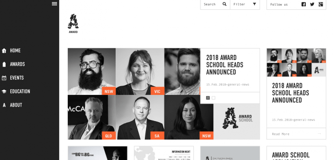
Nowadays there are increasing number of web designers adopting the vertical navigation trend because when it works it really does. This technique pushes the boundaries of traditional web designing and is generally used on portfolios and by creative agencies.
It turns out to be an experimental approach to the navigation design which can work on creative-oriented websites.
Why use this?
This technique should be used only when you’re opting for a full screen layout which is different from a traditional grid design.
It is not easy to create a vertical sliding navigation from scratch. Although if you are creative enough to experiment then it can turn out as a refreshing twist.
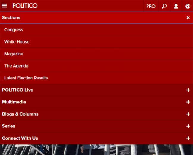
Globally Hidden Menus
Globally hidden menus keep the navigation hidden from view at all times. This technique is quite strange because the visitor is unable to find the links quickly. On the other hand it does clears up space on your web page by removing the navigation from the sight.
Why use them?
The best case scenario for a globally hidden menu is with tech-savvy audience. These users are able to recognise the icons. So it is suitable if you’re designing a tech blog or a B2B digital company then this works.
But if not, you have to think thoroughly before you pot for this navigation technique and be aware that you are not giving up upon the content against the style.
Responsive Subnav Menus
You cannot afford to avoid mobile navigation while designing website. Designers often hide the navigations links on mobile in order to fit better on small screens.
But nowadays many sites follow the technique of keeping the navigation menu by using drop-down menus. This technique is only seen in mobiles and In small browser windows.
Why use them?
The users of your website should have access to your website irrespective of what device they’re using. Better opportunities can be offered to the users by keeping the sub-menus in place. While implementing this technique one should be clear enough that each sub-menu is clearly denoted with an icon, colour change, or something visual. Users should get a clear view if clicking/tapping on link will open what.
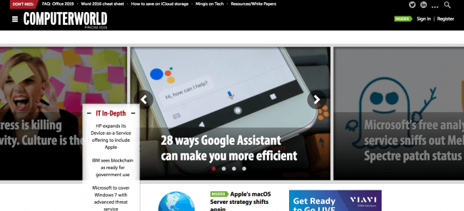
Top Story carousels
This technique is popularly used on blogs and high-volume news sites. These sites publish dozens of new articles everyday.
A simple carousel on the top of the page will offer the visitors a chance to check out the latest articles. All the feed inside it can be changed or modified dynamically as and when required. Also they can be styled with thumbnails.
Why use them?
A high volume content blog should have top story carousels to enhance the user experience. The average total time on website can be increased because the visitors are able to find the recent stories more prominently. Designers who needs to increase the number of visitors on their site should use this technique.
Table of Contents
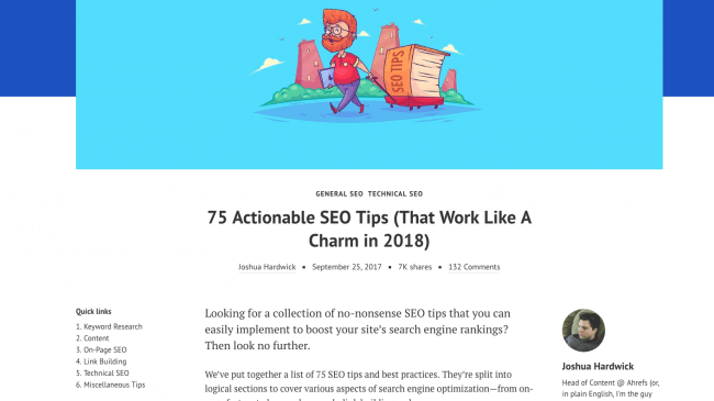
The table of contents boxes are added into longer articles with defined sections. The most prominent example of Toc is Wikipedia.
Why use them?
The most important thing to use Table of Contents is to increase the user experience. Nowadays there are longer articles which are quite intimidating, a ToC reduces the intimidating factor. This technique also helps in ranking of Search Engine Result Pages.
All-caps corner links
A very delicate navigation technique widely spreading over the past few years. An all caps-text style for navigation is used by every start-up and professional business to look intuitive and symmetrical.
Styles followed by this nav are:
- All Caps
- Small lettering
- Sans-serif fonts
- Extra horizontal spacing
- White or very light hue
Why use them?
This navigation method is fully professional and noticeable and gives a sense of trust to the visitor. It is best suited for start-ups or corporate website by giving away its professionalism.
This navigation method is fully professional and noticeable and gives a sense of trust to the visitor. It is best suited for start-ups or corporate website by giving away its professionalism.
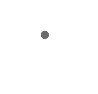
Single page dot navigation
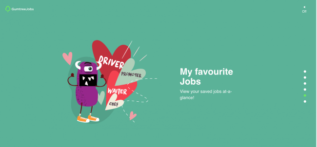
A dot navigation technique is a series of circular icons located on your web page Each dot represents a different view. As this technique contains a layout if one long page, links are highlighted to indicates the visitors current location.
Why use this?
The dot features can be an alternative to sticky navbar if you don’t want a top navigation. It becomes easier to see what each slide represents and the type of information contained in it.
About us and this blog
We are a digital marketing company with a focus on helping our customers achieve great results across several key areas.
Request a free quote
We offer professional SEO services that help websites increase their organic search score drastically in order to compete for the highest rankings even when it comes to highly competitive keywords.
Subscribe to our newsletter!
More from our blog
See all posts